Aradune said:Also what did you guys think of the new human male model? It's an early version still, but we rolled it ourselves, e.g. it's not a Unity store asset.
That was the first thing I noticed that has changed since the last stream. I think you're definitely going in the right direction.
Keep up the good work.


Aradune said:Thanks all -- looking forward to our next twitch stream which will be quite a bit longer and reveal much more :) It's gonna rock! :)
Also what did you guys think of the new human male model? It's an early version still, but we rolled it ourselves, e.g. it's not a Unity store asset.
Model looked fantastic. Run animation looked a little stiff and the transition between movement and resting, particularly while strafing, seemed a bit jerky. I think it's smoothing the transitions between specific movements and animations that give it a more realistic and natural looking quality.
Art direction is solid. Moderate realism is what this playerbase wants. Human model is very rough. Understandable for pre-alpha, but I hope you guys know there is a lot of work to do on just that model still. Human might be the hardest of all though, since we know exactly what it should look like. Animations were awful. Again, expected to a degree. Though you need to polish it up quite a bit if you're going to release a demo leading to another KS campaign. We're all on the same team here, everyone wants this project to succeed. Keep up the hard work. Looking forward to the team expanding with more artists, programmers, coders, and animators. Personally, I was pleased to see some work on personal art assets.
Awesome! Great presentation.
First thing I thought was the armor, at least from the back, looked a little Everquest 2-ey.. I think it had to do with a sort of over "smoothness" to the armor, a texture/color thing. No worries, I know it's still early art. I really like the face and body model overall, looks very close to how you're representing humans on their race info page.
I always think weapon particle effects should be as minimal as possible, and I'm not really into trail effects. I think that hammer would have been cooler if it just emitted that awesome, subtle blue light and didn't have the blue trail. Makes it seem more realistically magical, imo - like an enchanted Elvish weapon from the LotR universe.
Overall, the game looks like it has the magic of EQ1! Great work VR!

As a Designer and 3D graphics artist myself, I can say that I liked the new human model. It is not too realistic and not too cartoony. You are getting close to a good place :)
I know that it is really hard to find the balance, especially with humans, because we all know how they should look. It is all about the balance, and also the balance between characters/races. They should feel a part of the same world yet different.
Be carefull that you do not make the models have that odd stance that the updated EQ1 and teh EQ2(they were horrible) models had, where it looked like the head was so far back that it looked like they had a broken neck.
As others say, the animation is not there yet, it looks to be too quick and has no ease-in/ease-outs. I do feel that when running, it shouldnt be a blinking thing, so maybe let it take longer strides when running, and keep in mind that it should be working with speed increasing spells, like the old EQ Spirit of the Wolf or Journeyman boots. another thing that I have noticed, is when you turn the body, the whole character just spins so it gives the dreaded sliding feet. Maybe see if you can make a system where the feet are locked to the ground and then moves to a new position when the character has been turned a certain degree - this will make it look more natural (but also be a hell of a lot more animation work)..
One thing I miss in general in the graphics, is specular maps. Everything is so diffuse (that is especially in the environment). When everything is so diffuse, it make it hard to differ shapes in the pictures. Even your dynamic lighting from the torches etc, looks diffuse. And it is not a lot of specularity that is needed, just like enough to paint the shapes, so dont go all in with 100% specularity, just sutbtle effects.
It is starting to look good though.Keep it up.
Radeon said:I'm just going to list the things I've absorbed from the gameplay stream...of course, things will change:
- Stats start in single digits rather than double like in EQ1. STR/STA 18, AGI/DEX/CON/INT/CHA at 8, WIS at 27 for a lv. 13 Cleric.
- Item names: Coldark(?) Steel Great Hammer / Copper Banded Round Shield / Fadesteel(?) Key / Steel Great Mace
- 75 of one single currency that looks like platinum.
- "Ratkin" enemy
- "This Pillar Looks Ancient" just like in the stream, meaning this may be the same dungeon from last stream.
- The icons at the right might be the "spellgems", the top is likely the buffs, and the bottom is the hotbar.
- UI looks very much like EQ1 and obviously can be moved around like the Velious UI.
- There's something below the compass that looks like a map or something, too hazy.
- A square on top-left of the hotbar may be telling the environmental conditions, although it didn't change when inside the dungeon.
- Tilde (~) is the auto-attack key :V. The auto-attack button is to the left of the hotbar, and ranged weapon w/ amount of ammo (stack of 99) remaining on top of it, although I don't think Clerics use bows...
- The hammer emanates light that reflects on the plate the cleric wears.
- I really like the look of that gold disc and the dragon(?) below it at the stone bridge close to the beginning.
- The guards are fully clothed with visor helmets and massive amounts of plate, kinda like grim Qeynos guards.
- Hopefully those lamps on the bridge turn on at night :O. Long way down if you jump from that bridge.
- Jumps over the broken section of the wooden dungeon bridge.
- No idea what that right-most hotbar button was.
- And most importantly, the area before he zones into the dungeon looks familiarly bland :D
Nice summary. The game is looking very nice. Kudos to VR. The new model looks very good. Animation definately needs a bit of tweaking, but overall lookin good. I noticed a few of the buffs being cast: Bolster, Exhort, Fleeting Lupine Aura and Spirit of Cheetah. Curious if the Spirit of Cheetah is their version of SoW?

Grymmlocke said:Radeon said:I'm just going to list the things I've absorbed from the gameplay stream...of course, things will change:
- Stats start in single digits rather than double like in EQ1. STR/STA 18, AGI/DEX/CON/INT/CHA at 8, WIS at 27 for a lv. 13 Cleric.
- Item names: Coldark(?) Steel Great Hammer / Copper Banded Round Shield / Fadesteel(?) Key / Steel Great Mace
- 75 of one single currency that looks like platinum.
- "Ratkin" enemy
- "This Pillar Looks Ancient" just like in the stream, meaning this may be the same dungeon from last stream.
- The icons at the right might be the "spellgems", the top is likely the buffs, and the bottom is the hotbar.
- UI looks very much like EQ1 and obviously can be moved around like the Velious UI.
- There's something below the compass that looks like a map or something, too hazy.
- A square on top-left of the hotbar may be telling the environmental conditions, although it didn't change when inside the dungeon.
- Tilde (~) is the auto-attack key :V. The auto-attack button is to the left of the hotbar, and ranged weapon w/ amount of ammo (stack of 99) remaining on top of it, although I don't think Clerics use bows...
- The hammer emanates light that reflects on the plate the cleric wears.
- I really like the look of that gold disc and the dragon(?) below it at the stone bridge close to the beginning.
- The guards are fully clothed with visor helmets and massive amounts of plate, kinda like grim Qeynos guards.
- Hopefully those lamps on the bridge turn on at night :O. Long way down if you jump from that bridge.
- Jumps over the broken section of the wooden dungeon bridge.
- No idea what that right-most hotbar button was.
- And most importantly, the area before he zones into the dungeon looks familiarly bland :D
Nice summary. The game is looking very nice. Kudos to VR. The new model looks very good. Animation definately needs a bit of tweaking, but overall lookin good. I noticed a few of the buffs being cast: Bolster, Exhort, Fleeting Lupine Aura and Spirit of Cheetah. Curious if the Spirit of Cheetah is their version of SoW?
Spirit of Cheetah is our GM super version, we have Spirit of Wolf for normal use :)
This is shaping up to be everything I wanted it to be. It looks very much like Everquest with updated graphics, which is exactly what I am looking for.
The model looked great. After playing EQ and WoW, those animations weren't that bad. Not amazing either, but .... pre-alpha so i'm not even worried.
Even in its current state i'd pay to play it and enjoy every moment.
Alexander said:Awesome! Great presentation.
First thing I thought was the armor, at least from the back, looked a little Everquest 2-ey.. I think it had to do with a sort of over "smoothness" to the armor, a texture/color thing. No worries, I know it's still early art. I really like the face and body model overall, looks very close to how you're representing humans on their race info page.
I always think weapon particle effects should be as minimal as possible, and I'm not really into trail effects. I think that hammer would have been cooler if it just emitted that awesome, subtle blue light and didn't have the blue trail. Makes it seem more realistically magical, imo - like an enchanted Elvish weapon from the LotR universe.
Overall, the game looks like it has the magic of EQ1! Great work VR!
I agree 100% with this. One pet peeve of mine is when everyone looks like they are fighting with light sabers. That gets obnoxious real quick, in my opinion. Many games look like a rave fight/dance club with all of the flashes and trailing effects for every swing of a sword. I tend to prefer more "realistic" graphics and effects, although I don't mind a bit of stylization, but please nothing approaching WoW graphics heh. I think it looks ridiculous when one shoulder pad is larger than the wearer's entire torso, and weapons are impractically large and unwieldy-looking. I loved that in EQ weapons (at least in the early years when I played) looked "elegantly simple" for the most part. That made the class epic weapons that much more awe inspiring.
Getting back on topic...I think the new models look very good (minus perhaps the weapon effects <3). As others have mentioned the animations are a bit stiff and rigid, but considering that this is how things look when the game is in a pre-pre-alpha test state, I'm extremely excited. It really brings back memories of the olden times in EQ.

Riply said: I liked the new model, didn't feel ultra realistic to me at all, more grittier similar to Vanguard or what I would in vision a new updated EQ1 would look like. With a little more polish on the run and general movement animations(Seemed to hold arms to high, stiff and run speed was off) it should be pretty solid imho. I like the art direction very much, I don't care for ultra realistic, can't stand WoW type graphics either.
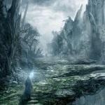
Based on the concept art, I think they're going for a slightly stylized, high fantasy theme with realistic proportions. I think they're steering clear of ultra realism or Heroic models despite the current look of the game in the Unite16 footage. And, in my opinion that's a good thing.
I did a quick imgur.com search for some high fantasy themes and models that I think represents the direction they're headed in. I could be wrong, but this is just my interpretation of it. And, like Dimoe mentioned, the "specular lighting" effects make a huge difference.
In this first one, the horse and rider are proportioned realistically, but they evoke a high fantasy feel. The hair and cape of the rider along with the color palette of the back drop really feel other worldly.

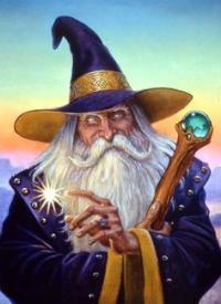
In this second one, which is by far my favorite, the Wizard is proportioned realistically, but she truly looks magical and high fantasy with that staff slung over her slight and slender shoulder. And, though the light emitting from the staff is modest in size, it's meaningful. Also, the moss covering the rough and ancient rocks, though, looks realistic at first glance, almost dances with life under her delicately, leather shod feet, purposely catching her every step.

And in this third one, the house is realistically proportioned, but the style of the roof and chimney, and the shape of the windows are definitely high fantasy. And, the environment is not too embellished. I love this one too.
