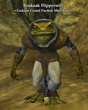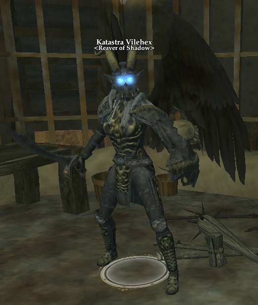
After watching the stream I was curious as to whether or not the way mob names are displayed are something already fairly set in stone or if maybe there will be other options available in the future? I feel like some space could be saved (for some mobs/types) if the mob nameplates could be split up.
Right now you have "Black Rose Mine Hand" or "Black Rose Crew Boss" but I wonder if maybe it might save space (in the combat log and on screen) if you could display names more like:
(Black Rose)
Mine Hand
(Black Rose)
Crew Boss
Something where the faction/group the mob is associated with is displayed above the mob name in a notably smaller font (instead of below like players in guilds tradtionally are).
Anyone have any other ideas?
(They are meant to be bracketed with <> but can't do that in a post I guess)

Agreed. The nameplates seemed awfully long.
Alternatively, give the mobs long and short names and allow the player to set which is displayed in their UI config. I noticed that because of the long names and proximity of the mobs, it was often difficult to read the name. This especially true when so much of the name is the same.
Maybe the full name is something that you'd only see when you con the mob and the nameplate could be shortened to simply "Mine Hand" or "Crew Boss". I don't want to lose the lore aspect of the mobs we're fighting by just naming everything "orc", but there needs to be a balance.


Nothing is set in stone in pre-alpha, I'm sure.
I too would like to see them 'toned down'. Also the font looked nice and clean, but very 'modern'. While I don't need olde worlde scrollwork cursive, something a little more 'fantasy' would be nice.
disposalist said:Nothing is set in stone in pre-alpha, I'm sure.
I too would like to see them 'toned down'. Also the font looked nice and clean, but very 'modern'. While I don't need olde worlde scrollwork cursive, something a little more 'fantasy' would be nice.
I think anything easily readible is going to look plain and modern. And I don't think that's a bad thing. Readibility is probably more important in this case. Immersion junkies will say that there shouldn't even be nameplates at all, so there's no point in trying to make them fantasy. What I think is interesting is the fact that there is a slight glow around the nameplates. I saw a few comments of people that liked it, but I'm wondering if it's really necessary - it might make things harder to read. I also find it interesting that effects such as the heat waves around the fire of a torch will morph the appearance of the nameplates. I suppose little things like that make it feel more like the nameplates are actually part of the world. All that said, with the UI, Brad has said that the solution is almost always to put as many options in the players' hands as realistically possible. If it doesn't really affect anyone else, you should be able to view it how you want. I have even seen some games that allow you to adjust the font of nameplates. I'd expect there to be a similar set of nameplate options in Pantheon.
Celandor said:Alternatively, give the mobs long and short names and allow the player to set which is displayed in their UI config. I noticed that because of the long names and proximity of the mobs, it was often difficult to read the name. This especially true when so much of the name is the same.
Maybe the full name is something that you'd only see when you con the mob and the nameplate could be shortened to simply "Mine Hand" or "Crew Boss". I don't want to lose the lore aspect of the mobs we're fighting by just naming everything "orc", but there needs to be a balance.
I like this idea too, an option for completely simplified nameplates for mobs without need to display their primary faction association or possibly even their race.
Using an EQ example it was very common for mobs to be named things like "A Gnoll Guardsman", "Flame Goblin Wizard", or "Orc Centurion", but the player already knows that they are looking at a gnoll/goblin/orc. With a little experience they would instantly know a Blackburrow Clan vs Splitpaw gnoll, a fire goblin from an aqua goblin, or a Deathfist vs Crushbone orc. You see it all the time in games but maybe there isn't a good alternative because looking at a mob and just seeing the name "Guardsman"/"Wizard"/"Centurion" might not be as interesting?
Bazgrim said:disposalist said:Nothing is set in stone in pre-alpha, I'm sure.
I too would like to see them 'toned down'. Also the font looked nice and clean, but very 'modern'. While I don't need olde worlde scrollwork cursive, something a little more 'fantasy' would be nice.
I think anything easily readible is going to look plain and modern. And I don't think that's a bad thing. Readibility is probably more important in this case. Immersion junkies will say that there shouldn't even be nameplates at all, so there's no point in trying to make them fantasy. What I think is interesting is the fact that there is a slight glow around the nameplates. I saw a few comments of people that liked it, but I'm wondering if it's really necessary - it might make things harder to read. I also find it interesting that effects such as the heat waves around the fire of a torch will morph the appearance of the nameplates. I suppose little things like that make it feel more like the nameplates are actually part of the world. All that said, with the UI, Brad has said that the solution is almost always to put as many options in the players' hands as realistically possible. If it doesn't really affect anyone else, you should be able to view it how you want. I have even seen some games that allow you to adjust the font of nameplates. I'd expect there to be a similar set of nameplate options in Pantheon.
Readable does tend to be plain, but modern? No. Or maybe it depends on what you think is 'modern'. Maybe I'm being a font geek, but there are plenty of plain, readable, up-to-date fonts that in no way look 'modern'.
Yes, I have done some design work with documentation in my time and so maybe I'm over-emphasising, but I have to say for most companies, especially those wishing to portray a product with an important image, think long and hard and put effort into their font(s). You can spend a fortune on your message and your logos and whatnot and then make materials that look dirt cheap by just using standard looking fonts.
The current font for nameplates looks like they've left the Unity default in place (somthing like Ariel Bold). The fonts used in some of the dialogs look like Impact. Both very standard, modern and every-day feeling fonts. The kind of thing you'd see in an internal technical document in a small industrial office hehe.
It's like someone making a poster for an event and just using default Word fonts on their home PC. Sure, it will look clean and tidy and be readable (exactly how Microsoft define default fonts) but will also look cheap and tacky because people will, consciously or sub-consciously, know that they just used the default fonts.
In comparison, I just played LOTRO for the first time in ages and the fonts there are much more subtle and don't look modern, but without looking twee and olde worlde. They are also less in-your-face and cluttered, but still very clear. They've clearly had their own font(s) designed and those used for nameplates look great and don't feel like they overpower the screen with immersion-breaking text.
EDIT: It's notable that most of these games have their own "screen" font (dialogs and nameplates) but the text window for chat is usually much more modern. It makes sense that what's in "the world" is more in-keeping with a role-playing theme, but the part that is obvious OOC - the scrolling text info - is in a more modern font.
EDIT2: And re. the glow... Oh no hehe. Even worse, in my opinion, than the modern font. It makes it look like, especially in a dark dungeon, everyone has a 'real' neon sign glowing above them. I almost expect them to work as light sources for the party, except they feel like the game is supposed to *look like* a game.
All-in-all I'm really hoping these are very early placeholders made quickly hehe.

When I watched the stream, one of my thoughts was 'Oh wow, I can actually see and read who is who. This is great.' But then, I'm legally blind. So it really does not surprise me that people with (I'm guessing) less vision issues are having a different experience. If they change it's not the end of the world--I'll follow my group, cycle through enemies until I see which is having it's health bar turn red, and then attack. But I do always find it interesting how differently I see things because of my eyesight.
katryn said:When I watched the stream, one of my thoughts was 'Oh wow, I can actually see and read who is who. This is great.' But then, I'm legally blind. So it really does not surprise me that people with (I'm guessing) less vision issues are having a different experience. If they change it's not the end of the world--I'll follow my group, cycle through enemies until I see which is having it's health bar turn red, and then attack. But I do always find it interesting how differently I see things because of my eyesight.
This is a perfect example of why the best solution is just to give the player options to adjust font, size, color, etc. to view the UI in whatever way is best for you. A ton of people have different needs/preferences. It doesn't matter to anyone else, so why not? It's not complicated :)
jpedrote said:Another nice detail to the names would be adding different colours, nothing too flashy like red, yellow or bright green, but having party/players member as blue names and NPC's with white names would be a nice distinction, also having grey names for dead NPC's
This is also what I was thinking while watching the stream. I was less distracted by the font and length of the names, as I was thinking "they should just distinguish them with color..." Just my thoughts