Before we begin, let me explain what I mean by item icon: This is the picture you see when an item is in your inventory or on a corpse. I am not referring to the physical appearance of an item someone is wearing.
Assuming the game will follow a single theme (as I think it will/should), we'll consider that item icons can can range from vibrant and very animated-looking (cartoonish) to very realistic.
On a scale of 1 - 10, 1 being vibrant and cartoonish and 10 being as realistic as possible, where would you place your ideal theme for item icons?
For reference, 1 or 2 would be WoW-esque while Classic EQ item icons would be around 7 or 8 (IMO).
I personally really liked EQ's item icons. I felt they had a rather realistic feel to them and really appreciated the more "serious" style (like banded bracers showing a bit of rust). I don't really apprecaite the more animated/cartoonish style in games like WoW.
I think I would place my ideal theme at 9 or 10, adding a little bit of flare here and there where necessary (maybe "glows" and such for more prestigious items, like epics, raid items, and higher level dungeon drops).
(Some people really might not care, but remember that these are the icons you will see every time you loot a corpse, look at your paper doll, inspect someone, move stuff around in your bank, etc...)

I would go for the perfect 10. No artificial vibrancy whatsoever. If the item looks realistically vibrant in the context of the game world then the icon should match, otherwise, I look forward to the plain old dingy armor. It makes the really cool stuff feel much more special when you get manage to get your hands on it.
I'm happy with how the icons are progressing. As long as the icon in some way represents what the spell does, it should work. I have a different philosophical opinion about how a UI should look and feel, but what they have looks nice.
oneADseven said:I would go for the perfect 10. No artificial vibrancy whatsoever. If the item looks realistically vibrant in the context of the game world then the icon should match, otherwise, I look forward to the plain old dingy armor. It makes the really cool stuff feel much more special when you get manage to get your hands on it.

Around 7. If it were 'realistic' you wouldn't be able to see what half items are.
It needs to be a quickly recognisable representation.
disposalist said:Around 7. If it were 'realistic' you wouldn't be able to see what half items are.
It needs to be a quickly recognisable representation.

I like a more realistic approach to both item and spell/skill icons (7-10). Having said that, what I do hope is that Pantheon will not reuse icons for different skills/spells. This includes just changing the background color. For example, Vanguard did a bad job with this. Too many spells had the same basic icon. Each and every spell or skill should have a reasonbly unique and representative icon for it. I'd like for this to also carry over to items but realize that is not particularly practical since there will be a vast number of items in the game. So as long as most items are differentiated based on what they are from other significantly different items then I am ok with that.
Just my two cents....
I don't care (much) about the appearance of equipment or spell icons. What really matters is that they make the item or spell easy to find in the UI.
There needs to be some balance between the realism of the icon against the item appearance, given that the icon is a small fraction of the scale of the item when equipped on your person. You may have two pairs of brown boots, one of which has gold trim. The trim may have to be over-emphasized in the icon, otherwise, it may be too small or pixelated to be seen, making the two pairs of boots indistinguishable.
Kaen said:disposalist said:Around 7. If it were 'realistic' you wouldn't be able to see what half items are.
It needs to be a quickly recognisable representation.
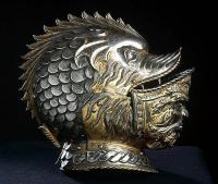
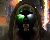
I don't know if this will affect your response, but by realistic I don't mean that the item's appearance in the icon will match exactly the appearance of the item. For example, in EQ the helmet in my photo might appear as a fine steel helmet or some such. In that case, it would be a question of the artistic expression behind the "fine steel helmet" icon (animated and flashy vs. realistic). I suspect that not every single item in the game will have its own unique icon, though I could certainly be wrong. As I mentioned, I was always a fan of how EQ approached this. Many items shared the "banded" icons, but the banded icons themselves had a nice, realistic feel.
Yeah that I'm with and I think icons can be made 'useful' as you imply, they can denote the 'tier' of the item, making it further easier to identify/categorise/sort/etc.