This might be discussed before, but I could ony find single private forum messages that I am not allowed to read further.
I recently saw a podcast with #CohhCarnage.
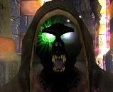
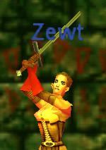
It was a small dungeon crawl in a dark sinister enviroment, with torches and it seemed it could be beautiful. But the screen was also blurred with floating names like 'Cave spider', 'ulthiran blaspheme', 'ulthiran blaspheme', 'ulthiran blaspheme', 'Cave spider' and ofcourse the six nametags of the players. The whole screen is filled with them often making it a unreadable mess of pretty long names.
It was also declared you can turn these nametags off. Which makes the world much prettier and much more dangerous as you now do not get a floating name hint where the mob resides. Because the floating names are such good warning signs, there is a good chance nametags will always be on, especially for pullers.
I recommend having floating names off as a standard setting. But with a subtle way of still seeing what or who you are dealing with by only showing the floating name if you have it targetted the monster or have your mouse go over the monster at a pretty close distance. It would make the world much prettier and reading the monsters name easier too.

Qulash said:This might be discussed before, but I could ony find single private forum messages that I am not allowed to read further.
I recently saw a podcast with #CohhCarnage.
It was a small dungeon crawl in a dark sinister enviroment, with torches and it seemed it could be beautiful. But the screen was also blurred with floating names like 'Cave spider', 'ulthiran blaspheme', 'ulthiran blaspheme', 'ulthiran blaspheme', 'Cave spider' and ofcourse the six nametags of the players. The whole screen is filled with them often making it a unreadable mess of pretty long names.
It was also declared you can turn these nametags off. Which makes the world much prettier and much more dangerous as you now do not get a floating name hint where the mob resides. Because the floating names are such good warning signs, there is a good chance nametags will always be on, especially for pullers.
I recommend having floating names off as a standard setting. But with a subtle way of still seeing what or who you are dealing with by only showing the floating name if you have it targetted the monster or have your mouse go over the monster at a pretty close distance. It would make the world much prettier and reading the monsters name easier too.
I can't dig up a link, but I'm pretty sure I've heard devs say there would be options related to whether and what parts of the name tag is shown.
Whether or not you see it at all, how far away they appear, or whether it just has first name, last name, title, guild, etc. will probably be optional.
It has changed in the streams over time, too. They are still definitely playing with how visible they are.

In a game like Pantheon where things are not supposed to always be overt and obvious it may make sense to not have floating nametags even as an option. Not for anything you can attack or that can attack you. It makes it far too easy for you the player to see things that your character cannot see because it is hiding or blocked by terrain. I would be happy with enemies where you cannot see their nametag unless you can mouseover them in which case you get whatever information is available.
Good idea, Qulash.
This makes a lot of sense. Of course I expect us to be able to turn off name tags in our settings, but I think there should be some restrictions on them that we can't bypass. I see no reason for a floating name tag above the head of an enemy who is hiding behind a rock, waiting to ambush me. In addition, when a half-dozen mobs pour into the room to attack my group, why should they have signs above them allowing us all to instantly recognize which one is the most/least dangerous?
I agree with the idea of a name tag not appearing unless and until I target/mouse over that mob. In addition, (since tab targeting will likely target a hidden mob even if I don't know where it is) a mob's name tag shouldn't appear unless I have line of sight on it.
I really like this idea, in the last stream the screen was really busy overpowering the game world completly looked more like a play the UI kind of game. Restricting the floating name tag to the current targeted mob would be amazing and make situational awareness and looking at the game world to identify multiple targets a really important skill.
Also the (corpse) indicator, could hide the full name until you click the mob, and have a smaller font and less opacity, because when there are many dead things on the screen, it will be a mess.

It would be interesting not to have the name tags at all...maybe just in my "selected" window when I mouse over or select at reasonable range...being able to see the different dispositions based on skin tinting etc seems like it could draw us in more.
If that's an option, it would be desirable to have it designed into the cues such that there isn't a big advantage to those who use it...It would awesome to identify the shimmering heat coming off an aggressive dispos that's visible at a reasonable distance. I should say...not a big fan of tags on anything, but selecting the right npc the first try in battle...priceless

One of the streams, I think it may have been the first-pass lighting one, I seem to recall seeing a "draw distance" slider for the names. It appeard to be a slider that on the one end had names off, and on the other end had names on down the foll length of the draw distance in the game. That being said, they did also mention that they'd "always" (whatever that means in this context) err on the side of allowing people to turn things off, in the same stream.
Thanks for all the replies.
Sarim: If the option of nametags is there, it would be turned on by almost everyone, especially by monster pullers because they are such good warning signs. There is talk about having different enviroments, maybe area's could be foggy or really dark. In these conditions, monsters would be very visable because of those name tags. It would make any applied darkness or fog handicap useless, at least visually
If the tags are off, you would be looking for any small movement a monster would make. Any dungeon crawl/adventure would be more intense as you never know if there is a monster nearby you or your monster puller overlooked.
Bearr: A selected window, why not. Your groupmates health are visible in a window too. The idea of skin tinting gave me a reverse idea. When certain classes get close to certain monster they get "chill on their backs" or "skin tingling". I recall clerics or Paladins have something like emitting light close to undead, things like that could really be useful then instead of just for fancy
Kalok said:One of the streams, I think it may have been the first-pass lighting one, I seem to recall seeing a "draw distance" slider for the names. It appeard to be a slider that on the one end had names off, and on the other end had names on down the foll length of the draw distance in the game. That being said, they did also mention that they'd "always" (whatever that means in this context) err on the side of allowing people to turn things off, in the same stream.
I do remember seeing this as well in one of the streams.
But as they did in Vanguard, I expect name tags/labels will be possible to turned off by players. It's part of the RP experience.
Meaning I can turn off MY name so you can't see my class, levels, etc. Even if you try to list them in chat. And you can also choose to turn off seeing them.
In Vanguard players would use chat to track down high level crafters for making things. It got a bit tedious and many people would hide that info.

dorotea said:((but since it makes raiding easier they will be required))
One can hope. This isn't a raiding game and the design objective is not to make things easier.
"but since it makes raiding easier they will be required"
That's a really big stigma becuase players will always take the path of least resistance and do what's easier (especialy in a game where failing/daying is punishing). If the option to hide nameplates is there, some people will use it, but the majority will never touch it, even if they hate the way the screen is filled with them and would much rather have a clean UI with one or 2 nameplates, that will not be and realistic option because turning off nameplates (except the main target and the one you're mousing over) makes the game harder and handicaping yourself in an already hard game is not ideal, that's why the devs need to make these decicions for the players, and restrict some of the UI elements, so the majority of the playerbase doesnt feel foced to use UI options they dont like, just because it gives them a boost performance.
I think we can all agree that a clean UI is a great UI and makes the game a whole lot more enjoyable, but it's up to the devs to ensure that a clean UI can be obtained without sacrificing gameplay performance.
Grayel said:Alexander said: Great idea to have titles display on mouse-over!Or perhaps as they are tab targeted?
why not both, have your main target show the nametag, and an extra nametag can show up over the target you're mousing over, limiting the enemy name tags to 2 in the screen at all times, and the same could aply to party members, only show their nametag when they're targeted on the defensive target window and when you mouse over their character, this makes the total nametag on screen never over 3 if you're just with your party, and NPC's (players outside your party always have their nametags up though)